

This article covers how you can customise your design space. As the design editor, you can decide how to use colour, layouts and set content hierarchies to reflect the design you are creating.
Ready? Let's personalise our design space 🧑🏻🎨


Tip: You will build up your own pallet of colours for quick re-use on future items.

Tip: You can use your own colour system to decide on the colours that mean the most to you.
Guidance
Colours can be used to signal various aspects within a design. Use them to signal a learning type, the status, flagging items that need attention, a topic or theme that occurs across the design or something else! The choice is yours.
Aim: The aim is to give you more visual space for larger designs. The larger 'sticky note' interface can be swapped for a 'row view' which gives you more space to edit content directly in the learning design canvas.


Aim: You can set up sections that contain nested sections and content items. This gives you more scope to set up structures that more accurately reflect the layers or structures within your design.

Step: Nesting child sections within parents - add more levels to show the required structure

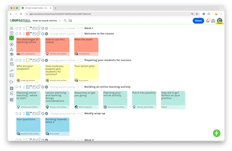
Tip: Indented sections will then become nested within the section above them. You can move sections up and down, the nesting will be retained within that section.You can nest sections up to 5 levels deep. Each depth is reflected by the visible bars and deeper nested colour. Example with 0, 1 and 2 sections nested / indented depth - example above.
Tip: You can add sections with no content items, to provide a heading for the indented Sections that live within in - as shown in the image above with 'Week 1' - it has no content items but it acts as the parent for the sections nested within it.
Indenting or nesting sections is useful for a quick visual structure. If you are integrating with an LMS or need to set an actual parent / child relationship with sections then you'll need to use the dropdown menu to set the parent of each child section - as shown below.

Note: Children can still be moved outside of their parent with drag/drop - so be careful if you do this to also change the parent once you've moved items around.
Aim: You can show or hide sections to maximise your view, hide content you don't always need to see and give space for your current working area. The view you create, with sections hidden (collapsed) or shown (expanded) will be personalised for you. Other editors in the design get their own expanded / collapsed view. Users who can Review & Comment will always be able to see all sections - they can't shrink or expand sections.

You can now see the section, but the content items have been hidden.


Tip: Once you start using shrink or expand, you will see how it can help give you more visual space. This helps give you focus on the current design priority areas.


Tip: This view is saved as your own personal view of the design, so you can shrink all sections and then expand sections as/when needed. This is helpful for larger designs, with lots of content items & sections.


